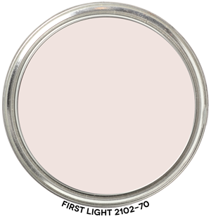
Review of First Light 2102-70 by Benjamin Moore
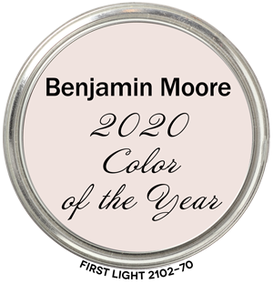
First Light 2102-70 Color of the Year 2020 belongs to the Red Hue Family. It’s a muted color of pink with a fair amount of colorfulness; you can definitely tell it’s a blushed pink and not beige.
One look at a chip of First Light and you’ll see a blushed pink. The vibe of this color is romantic, whimsical, lighthearted, new, calm, and mellow in the color of a ballet slipper kind of way.
When we look at the color data values, we can see that they also define and describe First Look as a “warm” pink that belongs to the end of the Red Hue Family at 9.52 R, right on the cusp of the Yellow-Red hue family.
Warmest Spot on The Color Wheel
Most interesting is this color lands right around 10 R (Red) which happens to be the “warmest” spot on The Color Strategist Color Wheel.
Complementary colors for First Light would come from the Blue Green (BG) Hue Family. Think warm pink and cool aqua, turquoise, minty greens.
Where to Use First Light
Wondering where to use First Light? Anywhere you want the vibe of a warm, blush pink that isn’t too cloying or sweet. Master bedroom. Perfect for a Nursery. Girl’s room (big or little). Bathroom. En suite. Living Room. Dining Room. Honestly, it would make the perfect backdrop in any room and work with a range of tastes and design styles.
It Doesn’t Have “Blue Undertones”
…. and it’s not “beige” either. Based on visual assessment of paint chips as well as the color data values for First Light, I disagree with online reviews describing First Light as “beige”.
The other thing I disagree with is describing it as having a “blue undertone”.
If you’re here, that means you’ve been following me for a while and you’ve learned why paint colors don’t have undertones.
It would take the perfect storm of unbalanced lighting conditions for First Light to appear bluish. Possible but unlikely and Benjamin Moore should edit that from their comments about First Light.
Because it doesn’t align with color measurements. The “blue undertones” thing doesn’t even align with the color naming system in First Light’s own fandeck. The Color Preview fandeck. First Light is categorized in the Benjamin Moore Color Preview fandeck under “inorganic colors” as “brown”.
Hue Family First Light 2102-70 by Benjamin Moore
Here’s First Light 2102-70 by Benjamin Moore in context of its Hue Family neighborhood, 10 R (Red), on The Color Strategist Color Wheel. The pink arrows point to where First Light 2102-70 fits in among the other colors according to its Value of 8.81 rounded to 8.88 and Chroma of 1.53 rounded to 1.50.


I completely disagree with Benjamin Moore’s selection of First Light as color of the year 2020. It is not a mutual color at all… It is markedly feminine, and would not be welcomed by a majority of the males in a relationship. It is not a contrasting color for selected walls either. All or nothing. Yes, I find it cloying, too much reds tones, although BM states it is not. I predict that sales of this selection will be very low, in comparison to previous colors of the year.
I absolutely love this color! My husband and I painted our cottage type house this color with white trim and a white picket fence. We get so many complements on it! We are really happy we chose this color. It’s not a sappy pink color. Instead it is a very soothing, softly pretty color of pink.
So glad it worked out so well for you, Rhonda!
We want to paint our (4 month old) daughter’s nursery First Light. What would be a complementary blue that we could use for our son’s room (who is 2 years old). Both rooms are connected through a shared bathroom. I prefer dusty and muted colors as opposed to something that punches you right in the face. Any suggestions are welcome!!
Hi! I painted our half bath this color and love it with the natural sunlight, however it is SO PINK with the bathroom lights on. I thought since it looked good with natural light I would use natural light light bulbs, wrong. Would you suggest warm lighting? Thank you!!
If it’s brand new, I’d give it a minute.
Our brain/vision system does this really cool thing called color constancy and you need to give it a chance to kick in. In two, three weeks you probably won’t notice that it’s much more pink when the lights are on. You perception of the color will level out and it won’t register that it looks dramatically different when the quality of light changes.