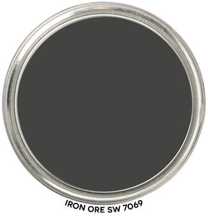
Color Review Iron Ore SW 7069
Okay – before you scroll down to see Iron Ore SW 7069 by Sherwin-Williams in context of its hue family, let me say don’t freak out because it belongs to the Green-Yellow hue family.
Colors like Iron Ore which are super low in Chroma from this hue family range are perceived as being the most neutral. In other words, Iron Ore is not very colorful, there isn’t any discernible trace of green-yellow when you look at it.
There is all kinds of interesting research that explains why near neutral colors, colors with no discernible hue, from this hue family neighborhood are perceived as “just neutral” but I won’t bore you with the studies.
What you need to remember about Iron Ore SW 7069 is that it’s a great option if you’re looking for a dark color that looks darker than a dark gray but not as harshly black as a true black.
Hue Family Iron Ore SW 7069
Here’s Iron Ore SW 7069 by Sherwin-Williams in context of its Hue Family neighborhood, 7 GY (Green-Yellow), on The Color Strategist Color. The pink arrows point to where Iron Ore SW 7069 fits in among the other colors according to its Value of 3.61 rounded to 3.62 and Chroma of 0.17 rounded to 0.25.

I have a White House with SW Dovetail gray shutters. I want to paint the front door a shade of black that will go well with the shutters. Would Iron Ore be a good choice?
Hi Sherry,
Technically, factually I don’t see any reason why Dovetail SW 7018 and Iron Ore 7069 would not harmonize or work together. Just make sure you like how they look as a color combination.
Hi Lori. I’ve added Iron Ore into my house color palette. (SW Alabaster and BM Whisper are my two others.) I am looking to add a mid tone gray. Am I correct in thinking I should stick with a gray that is in the yellow/yellow-green hue family? After checking out your color analyses it seems that SW Dorian Gray, Light French Gray or Classic French Gray are choices to consider. Am I on the right track? Thanks, Melodie 🙂