

Metropolitan AF-690 Hue Family
Here’s Metropolitan AF-690 by Benjamin Moore in context of its Hue Family neighborhood, 5 GY, on The Color Strategist Color Wheel. The pink arrows point to where Metropolitan AF-690 fits in among the other colors according to its Value 7.43 rounded to 7.50 and Chroma of 0.31 rounded to 0.25.

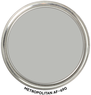
Metropolitan AF-690 Color Review
Metropolitan AF-690 belongs to the Green-Yellow (GY) hue family and it’s slightly lighter than mid-tone.
Metropolitan has a low Chroma value of 0.31. That tells us that it’s very close to a true neutral gray — the Atlas above illustrates this really well. Colors with low Chroma like Metropolitan are called near neutrals because they are literally so near a neutral gray.
Many people perceive near neutral colors, like Metropolitan, from this Green-Yellow hue family neighborhood as “just gray”. Because they don’t have the correct vocabulary to speak to color, they’ll often describe it as having “no undertones”. It’s important to not confuse the theory that colors have “undertones” with measurable hue family and I’ll talk more about that in a minute.
It’s also common for near neutrals from this hue family neighborhood to shift under certain qualities of light and look blue-ish. That doesn’t mean Metropolitan has “blue undertones” or that it’s inherently blue. It still belongs to the Green-Yellow hue family (D65 Illuminant, 2° observer), it simply might appear bluish in certain contexts and/or under unbalanced light sources. Remember if you change the light, you change how a color appears.
Metropolitan can also show its Hue Family roots and appear green-ish. After all, it does belong to the middle of the Green-Yellow Hue Family. The Color Strategist Color Wheel in the Colorography above does a great job illustrating this for you.
Whether it appears blue, green or “just gray” when you sample it, you now know why.
You also need to know that Hue Family comes from measuring the color using a standard, repeatable quality of light and it’s the wavelength measurement that determines what hue family a color belongs to.
Hue Family is an objective piece of color data – think of it as Color DNA.
When somebody talks about undertones, it’s just their best guess. It’s not a fact. It’s their subjective opinion about how they think a color looks under whatever random light source they happen to be looking at the color under. It’s not objective, it’s not consistent or repeatable.
PALETTE INSPO
Metropolitan is in the Affinity fandeck. These are all the colors that belong to the same Green-Yellow Hue Family as Metropolitan. Wondering what colors go with Metropolitan? I pulled a few colors forward so you can see how well they work together. They harmonize because they relate. They relate because they belong to the same Hue Family.Hue Family is the foundation of the color relationship(s) you see here. Hue Families… relationships…. kinda all makes sense doesn’t it?

Hi Lori-Laurel sent us here to read your excellent color blog. I was wondering what your thoughts were on how the use of different pigments in paint might effect one’s perception of the color? The pigments suspended in the paint base are very different to a pure color as expressed in other mediums.
Hi Susan,
The best part about colorimetry, which is the science of quantifying how humans perceive color, is that it doesn’t matter how the color was made.
When a color is fully cured and dry, it is what it is. It’s that final fact of color that’s measurable and therefore manageable.
The only thing that matters is what the color is and looks like when it’s dry.
The chemistry of color mixing is irrelevant to me because there’s nothing about a color when it’s liquid that I can control. My clients live with dry paint, not wet and the only thing I can manage is dry, fully cured color because I don’t work in a paint store mixing color.
Letting go of the idea that there’s something to decode in a formula is a big step for many because the formula, how color is mixed, is the only tangible reference they’ve ever had for color.
Once they learn about color order systems, data values and notations their entire color world opens up; it’s transformed from fumbling thru the substance uncertainties of colorants and bases to an orderly system of organizing color by the same 3 dimensions (hue/value/chroma) that the human vision system uses to process the sensation of color.
Thanks for the question and welcome to Camp Chroma.
This is fascinating! I have always felt like color and how it works is a mystery. Looking forward to reading your blog and learning a lot!
Susan: are you saying that even though the paint mixers might put a certain hue of pigment into the paint base, the final product on your wall will look different than the pigment did originally?
And Lori, are you saying that these color charts aren’t based on the original pigment, but on the final result that is on your wall as dry paint?
Just trying to clarify. Thanks!
Hi Diana,
You are correct. These color charts aren’t based on the original pigment, but on the final result that is on your wall as dry paint. Absolutely right.
I LOVE clarification. I can clarify all day. I probably over clarify. But I really, really, really want people to “get” this because it’s SO GOOD! I will to try to keep this to just a dramatic chapter not a whole passionate novel. 🙂
The colorants, the pigments, the bases, all the chemistry involved to mix/make a color, is totally irrelevant.
Because the formula is not the genesis of a paint color.
The formula is just a recipe of ingredients that alter and change each other as they are blended; their individual characteristics literally get blended away into the base and each other.
Rendering the formula, the list of individual colorants, useless.
The CIE L*a*b* value is what is used to figure out everything about a paint color — including the formula.
The question no one asks — but needs to — is where do the paint color formulas come from?
And the answer is theoretical color space. Specifically, CIE L*a*b* values.
The majority of the paint colors you find in fandecks have only ever existed as mathematically modeled paint chip.
The idea that the hundreds of thousands of commercial paint colors were mixed by hand, by someone with an “artist’s eye” is ridiculous if you stop to think about it.
Yet many consultants and designers like to wax poetic about colorants and pigments and bases even tho they are just the tangible ingredients needed to make a color born from theoretical color space.
But it’s the formula, not the CIE L*a*b* value or hue/value/chroma notation, that’s stuck on to the side of every paint can.
So, that’s why people glom on to the formula and why so many believe there is some secret code to decipher from the colorants and pigments – some kind of code that’s going to describe and define the paint color.
Nothing is sneaky, or hidden, or under anything.
It’s so much simpler than that. It’s almost funny how complicated the theories are that people concoct about pigments, colorants and bases.
But they just don’t know what they don’t know. The ultimate *code* that defines and describes a paint color is the CIE L*a*b* value.
It’s that same simple, straight-forward system used to create paint colors that should logically be used to specify color and I teach all about this in Camp Chroma.
Thank you for the lowdown on this Color of the Year! This is the first one I have actually liked in awhile.
This is a very informative post on the color of the year! Thank you so much for sharing. xo Nicole
I love that you broke down this color! I was hoping you would! I thought, in my subjective opinion, there was some green in this gray color. It’s a great color and I’m glad to see it named color of the year from Ben Moore.
Great post, once again and so true that light sources alter the perception of color, as do whatever that light is filtering through or bouncing off from! Great to have the color family info on this color!
I appreciate this entirely different perspective on the color of the year. The science of color is always so interesting to me.
Wow! thank you for explaining the color more in detail. I’ll need to dig into your blog more to learn more about how to look at color. I appreciate the science behind it and not just eyeing it.
So intersting, I have such a hard time determine the true undertones of “Grays”. Loved this thorough breakdown, thank you!
Hi Sonia,
The good news is you don’t have to try to determine undertones of “grays”.
Because every color including colors of gray belong to a hue family and that information is super easy to look up online. The Colorography Lab is a good place to start. We map all the important attributes of color out for you including hue family. https://campchroma.com/blog/‘
We’re adding new colors daily.
Love this detailed insight. We’re on a lake in Washington with tons of light from W, N & S, so everything reads lighter. After 14 samples! we’re thinking of Metropolitan for open living/kitchen walls, and wanting a complementary color for the open adjoining entry & loft…. all very high ceilings. Hoping for just a hint of blue or green undertone so a little more welcoming not cold. Thoughts? Wickham Gray? Healing Aloe? I’m stuck as we don’t want dark (washes out anyway), beautiful lighter colors can get blinding in our space, and mid-tones seem to be very uncomplimentary, rather than giving depth. Thanks so much!
Hi, I find your perspective fascinating; especially because I have been ruminating over a gray or griege choice for my kitchen/family room. I thought Metropolitan might be the right choice, but I don’t want a green tone. That said, do all grays have a green tone? I have granite that has a myriad of colors, but I would rather find a subtle bluish gray. I have golden oak cabinets. The more I look; the more stymied I get!!! Your thoughts??