
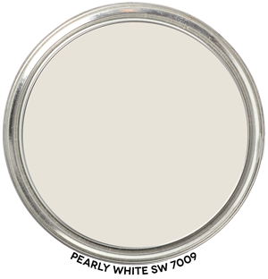

Hue Family Pearly White SW 7009
Here’s Pearly White SW 7009 by Sherwin-Williams in context of its Hue Family neighborhood, 5 Y (Yellow), on The Color Strategist Color. The pink arrows point to where Pearly White SW 7009 fits in among the other colors according to its Value of 9.00 and Chroma of 0.64 rounded to 0.50.

Thank you for this site, I find it very interesting.
I have a challenging living room that has ever changing natural light. It gets a little east light in the morning, mid-day south, and the most intense light from the west later in the day. The south and west windows also have an overhang from a verandah. It seems many paint colors I’ve sampled want to go green in the afternoon sun. It’s currently painted a reduced version of SW Natural Choice which is not working – gold/green undertone coming up.
For years it was painted BM Gentle Cream without this issue. I was hoping to move away from yellow and into more of a white, off-white, Greige or light cream. Would SW Pearly White ‘behave’ in this type of natural lighting or maybe a white like BM White Dove, or SW Greek Villa? This room has me stumped.
Thanks so much!
It could work. The best thing to do since you are clear about what you’re looking for is to grab a few chips/samples and see how they compare in the space.
Thank you for your reply.
I did decide to sample it. It’s a good overall color – very neutral, doesn’t pull green, but is slightly too grey for my home. I may try SW White Heron for a little more warmth. I don’t think it will pull green, but hopefully not red either! Undertones really show up with all the different lighting in this room.
What did you end up deciding? I’m debating and both Peary white and white heron are on my list!